
ABOUT GOODWILL
Goodwill is an American nonprofit 501 (c) (3) organization that is funded by a massive netrwork of retail thrift stores that provide job training, employment placement services, and other community-based programs for people who have barriers preventing them from otherwise obtaining a job. Goodwill will generally accept donations of clothing, shoes, books, accessories (handbags, belts), dishes, furniture in good condition, household decorations, small appliances including vacuum cleaners, and consumer electronics including alarm clocks. In 2010, Goodwill launched the Donate Movement to demonstrate the value that donated goods have for people and the planet. Goodwill's vision for the Donate icon is a universal reminder to 'recycle' through responsible donation, helping provide opportunities for others while diverting usable items from landfills.
The Problem
Most of us know we own too much stuff and we feel the weight and burden of our own clutter. Ongoing research has shown us that the average American home has over 300,000 items in one household. (1) One out of ten Americans rent off-site storage to store their unused goods. One out of four houses with two-car garages keep so much stuff in them that they can’t even fit a car in the garage. These statistics are confirming our observation: we own too much stuff and it’s robbing us of life.
Problem Statement
People own too much stuff they no longer need or find valuable, but they don’t know how to efficiently offload those items. How can people declutter their home by donating/recycling old goods more efficiently?
Primary Research Question
What improvements should Goodwill San Antonio adopt for its customer donation site to increase donations?
THE PROCESS
I set out to understand, improve and enhance Goodwill San Antonio’s customer donation website with a final deliverable of design recommendations that could help them increase the amount of donations and used goods they receive in the San Antonio market.
Research Goals
Gain a deeper understanding into what the user’s behaviors, needs and goals were when using the Good Will San Antonio donation website
Discover how users search for information and how they sort it into groups and why
Evaluate why a user makes a decision to donate items and how they navigate the site in order to do so
Goodwill Business Goals
Increase the number of people that choose to schedule a free pickup by 10%
Increase donations at drop off locations across the city by 5%
Gain an additional 1,000 new members to donate monetary contributions in 2019
research methods
Two research methods were used in order to better understand the user’s primary goals as well as define the design problems and opportunities in order to provide recommendations that would improve the Goodwill San Antonio website user experience.
#1 – Usability Test
A usability test is a qualitative technique approach that uses a structured interview focused on specific features in an interactive prototype or website and is one of the workhorses of user experience research. They can be done quickly and inexpensively and provide a lot of immediately actionable information. The heart of the interview anchored around a series of tasks prompted by myself. Here is a high level overview:
Six 20-minute one-on-one sessions held with the product users in a controlled environment with one evaluator
Participants were asked to perform five tasks while thinking out loud. They were then be debriefed and interviewed about the experience
#2 – In-Person Interviews
Observation is critical, but to really know the user’s experience, you have to ask him or her about it, and that’s the interview. User research interviewing differs from the kind of interview an investigative journalist or a prospective employer would hold. It’s more formal and more standardized, and as a kind of non-directed interview, tries to minimize the perspective of the person asking the questions. Here is an overview of the process:
Six 20-minute interviews will be held in a closed office with one moderator and Goodwill’s potential users
Interviews included 13 open-ended questions with an opportunity at the end to provide additional information
Recruitment Process
The quality of the information collected from user research is highly dependent upon finding the right users to interview. This is an overview of my process of finding, inviting, and scheduling the right people for my user research effort in order to gain deeper insights into their user’s goals, behaviors and pain points.
Target Users
Every product has a target user and I needed to understand the experience of the people who would be using the Goodwill’s donation website in order to provide knowledgeable recommendations for their redesign. My main focus criteria were behavioral, that is, I was looking for people who actually do or want to do the things that the Goodwill donation website offered. I identified the target users for this effort as follows:
Demographics:
Ages: 30-55
Gender: Male, Female or Other
Marital Status: Single, Married, Divorced or Widowed
Education: High School or Above
Income: $30,000+
Behaviors:
Used a donation service before
Stores unwanted items in household
People that are moving within a 6-month – 1-year time period
Technology Use and Experience:
Uses the internet at least two hours a day
Has gone online to learn about donation services or a way to offload used goods
Familiar with websites that have scheduling systems for delivery services
FINDINGS & INSIGHTS
This section is an analysis of the data I collected from the usability tests and in-person interviews that helped guide my final design recommendations for the redesign of the Goodwill San Antonio website.
USABILITY TEST FINDINGS
The quantitative information collected from the tasks the users performed, provided me with ordinal data that I was able to use in order to create an affinity map in which I was able to sort the information into clusters of findings. I then further summarized the clusters into categories and observations, finding patterns and themes that would not have been otherwise noticed. I took those findings and outlined the user journey map below in which I was finally able to understand the likes, dislikes and overall sentiment of how the users feel when navigating through the website. The journey map also highlights not only a major pain point in the home pick up process, but also a major flaw in the system in which the form is absolutely broken and needs immediate attention (see Phase 2) when the user is trying to finish filling out the form to go to next step.

in-person interview findings
Since I conducted in-person interviews, I was able to uncover a deeper understanding of the user’s needs and behaviors, versus what they might have said in online survey or a focus group. I sorted the categorical data into groups and then narrowed it down into themes and patterns. Qualitative data can be analyzed using recursive abstraction, which is the clustering of findings into summary groups, which are then further clustered and summarized, finally arriving at compact summaries. This technique helped me uncover patterns and insights I would not have known otherwise. Below is a summary of my findings from the in-person interviews.
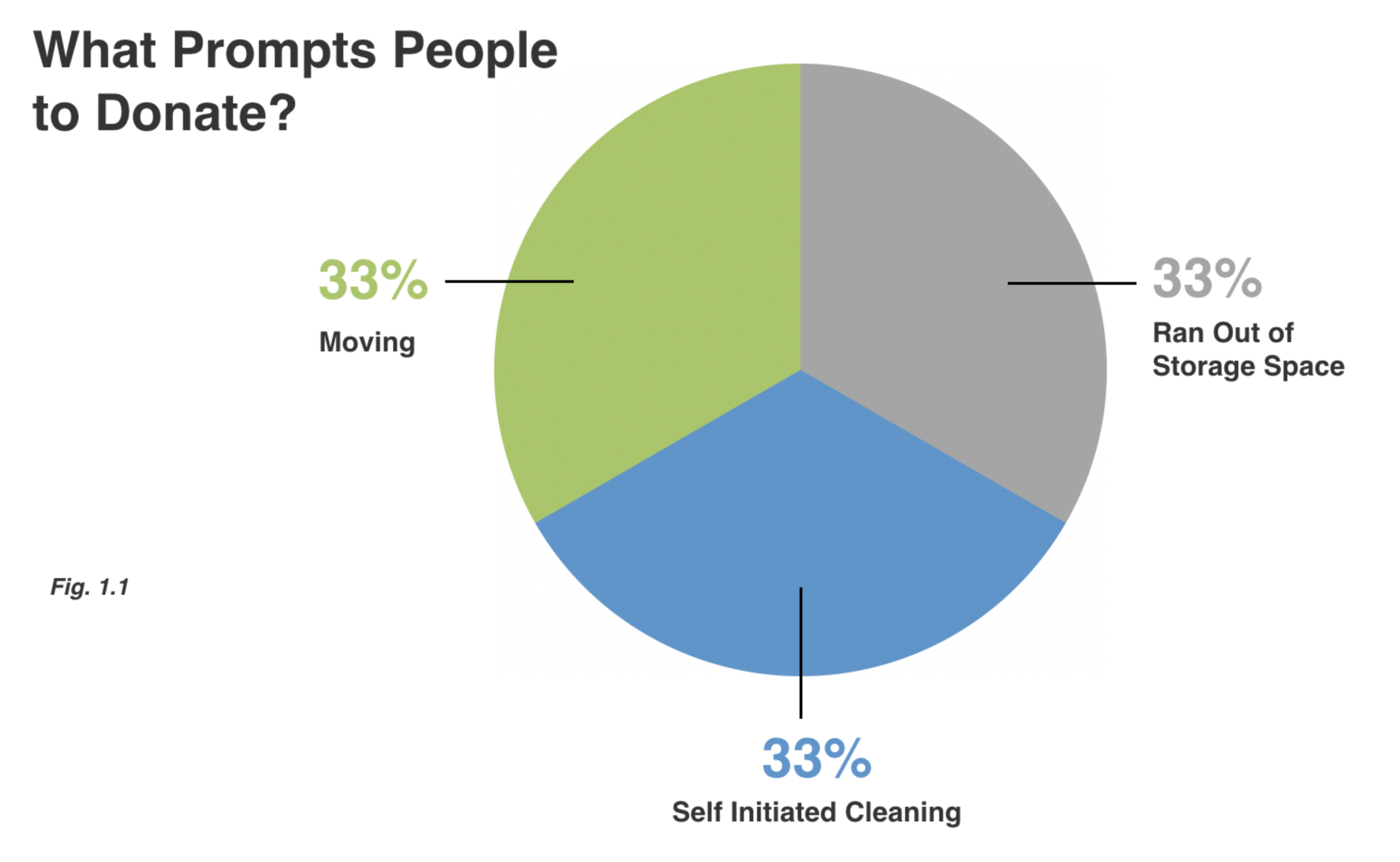

Fig. 1.1 – I was able to capture the user’s motivation as to what prompts them to donate in the first place. There was an equal split on moving residences, self-cleaning and running out of storage space.
Fig. 1.2 – The majority of our participants only donated once per year. Since all of our users were moving within a one-year period, this data makes sense and matches the user’s motivation.


Fig 1.3 – Since one of Goodwill’s business goals was to increase the number of donations they collect, I was able to show how large the San Antonio market truly is.
Fig 1.4 – I dug a little deeper into trying to define the type of used goods that the participatns had in order to show what types of items are currently sitting unused that could be of value to Goodwill San Antonio.

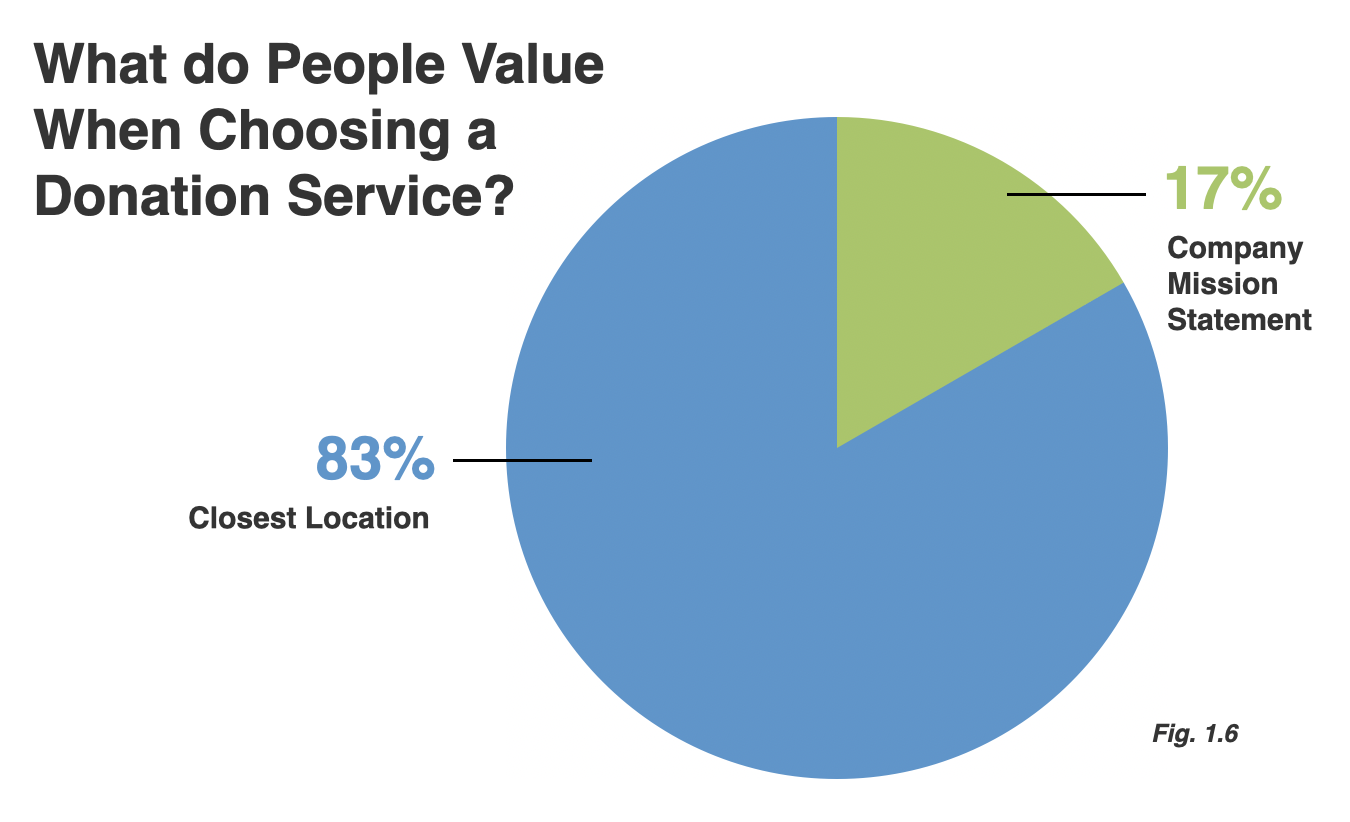
Fig 1.5 – 83% of participants said their biggest pain point of donating was finding the time to actually do it. When asked for more context, some people claimed to just store unused items in attics or garages since that was easier than finding the time to sort and donate. It showed me that although the users had many items to donate (see Fig 1.3) they were unlikely to take action and actually find the time to donate. This was very insightful that the pain point is big enough for them to halt their initial motivation.
Fig 1.6 – When I asked the participants what they valued when choosing a donation service they overwhelmingly opted for the closest location which is directly related to the Fig 1.5 findings of saving time in order to do it. Even though some users were very passionate about a company’s mission or cause, they admitted that they would ultimately prefer convenience and choose ease of use over everything as finding time to donate was a big pain point.

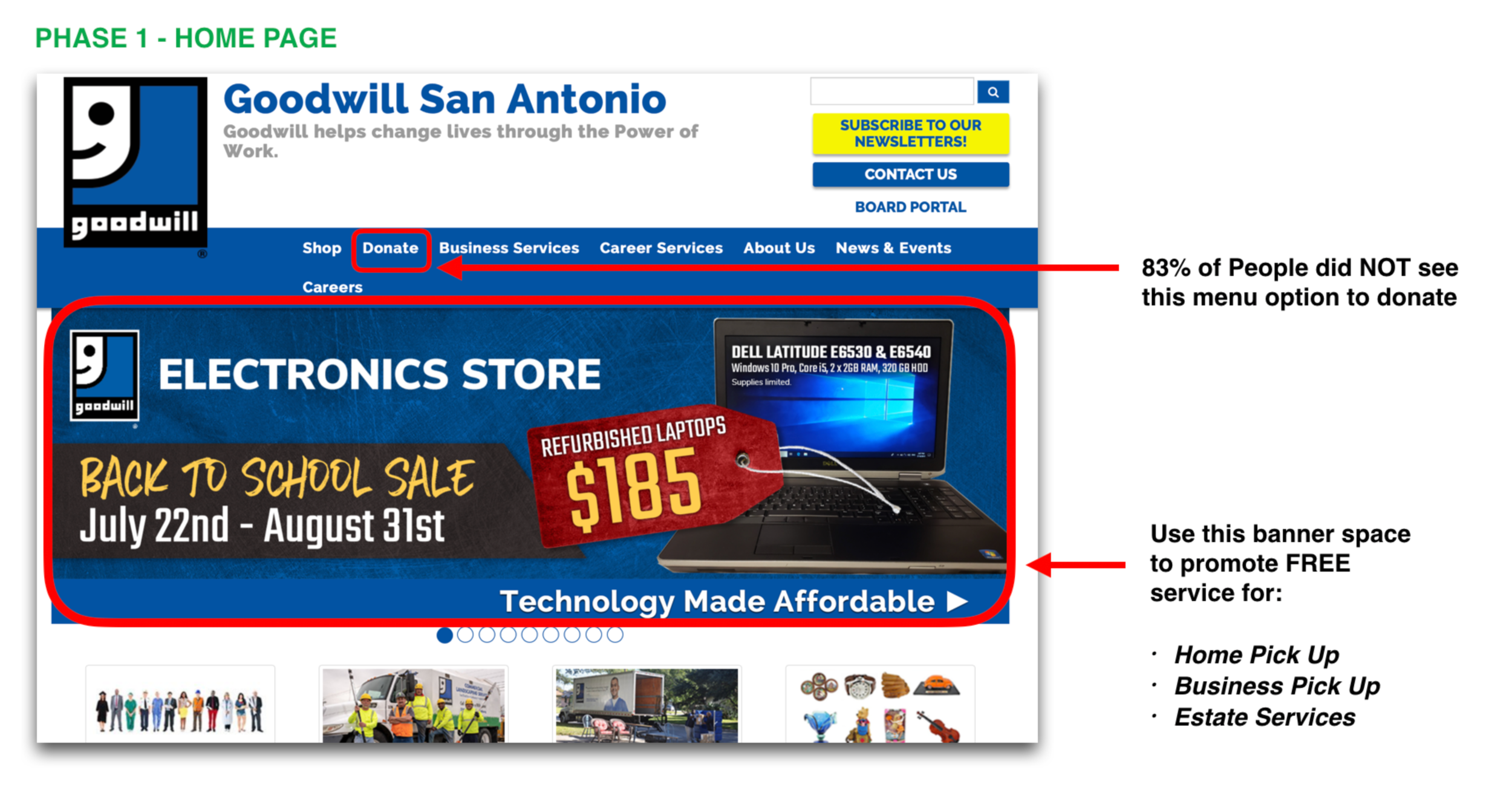
Fig 1.7 – Goodwill had several business goals surrounding the increase of donations (monetary and physical), but one of their main goals was to improve the use of their free home pick up service. When I listed out the services Goodwill currently offers, 83% of the participants didn’t even know Goodwill offered home pickup, let alone it being a free service. This just goes to show how big the opportunity is to market this service.
Recommendations
My five knowledge driven recommendations were formed based on the valuable insights and observations I collected from the in-person interviews and usability tests. I feel strongly that if Goodwill were to perform these changes, they would not only increase the use of their home pick up service, but they would be able to improve the overall user experience thus satisfying their primary business goal of gaining more donations and use of the home pick up service.
RECOMMENDATION 1 – Increase Visibility of Home Pick Up Service
My first recommendation was to promote the most unknown service that participants were not aware of which was the free home pick up service. The majority of users did NOT see the donation drop down menu item. I recommended utlizing the prime real estate home banner to promote the service as that is the first thing the users mentioned out loud as it instantly grabbed their attention. This should help increase the use and awareness of the home pick up service.
RECOMMENDATION 2 – Show the User a Summary of items they have pre-selected
When selecting items to donate, there was no way for the user to see the items they have selected from the drop-down menu lists. They could see the items they had selected only when they were within that category’s section. Once the user selected a different category the section collapsed and the users were unsure if the items saved or not. Several users actually toggled back and forth between sections ensuring their items were indeed saved. I suggested using the already existing summary side bar to highlight the items the user selected throughout the entire process in a real time view. This could help build confidence with the user that the site is in fact saving their information and also see a high-level view of what they have already logged.

RECOMMENDATION 3 – Remove unnecessary Instructional Text for each form field
The site had two lines of instructional text for every single form field, not only was this redundant, but the extra line item of additional text was in bright red.! Bright red is commonly used on websites to denote error or malfunction, it should never be used for instructional text to the user. I suggested removing the red text altogether as it was a confusion point for almost every user who went through our usability test.

RECOMMENDATION 4 – Assist the user ON what actual data input error is
This step in the process is absolutely broken, no matter what the user enters into the form field (whether it is correct or not) it triggers an error message. This is the biggest pain point on the user journey map and an absolute fail of usability. Not only is the process broken, but the system completely wipes out the existing data, and makes the user repeat the entire process. I suggested to only highlight fields that the user filled out incorrectly and leaving the correct information fields visible. This could help save the user time and frustration thus ensuring they have an overall better experience. If the user does in fact accidentally enter the wrong information, I also suggested increasing the size of the error message at the top of the page and give the user specific information that is wrong or at least let them know that the error is at the bottom of the page.

RECOMMENDATION 5 – enhance the navigation of the Interactive Calendar
My final recommendation references the final pain point on the user journey map within Phase 3 of the process in which the user tries to select either a specific date, or an available date provided by the system. Currently there is confusion on how to see future months, I suggested changing the “Next Week” text button to “Next Month” as well as using the empty white space to the side to add an additional next month so the user can swiftly glide with ease through use of a visual interactive representation. Prior to this screens, the site clearly states that the user must select a date 1-2 weeks out in advance, I suggested removing the text button that reads “Previous Week” since all of those dates will unavailable to select since they are in the past, which would help remove unnecessary information.

1 – “For many people, gathering possessions is just the stuff of life”, Professional Organizer Regina Lark, LA Times 2014